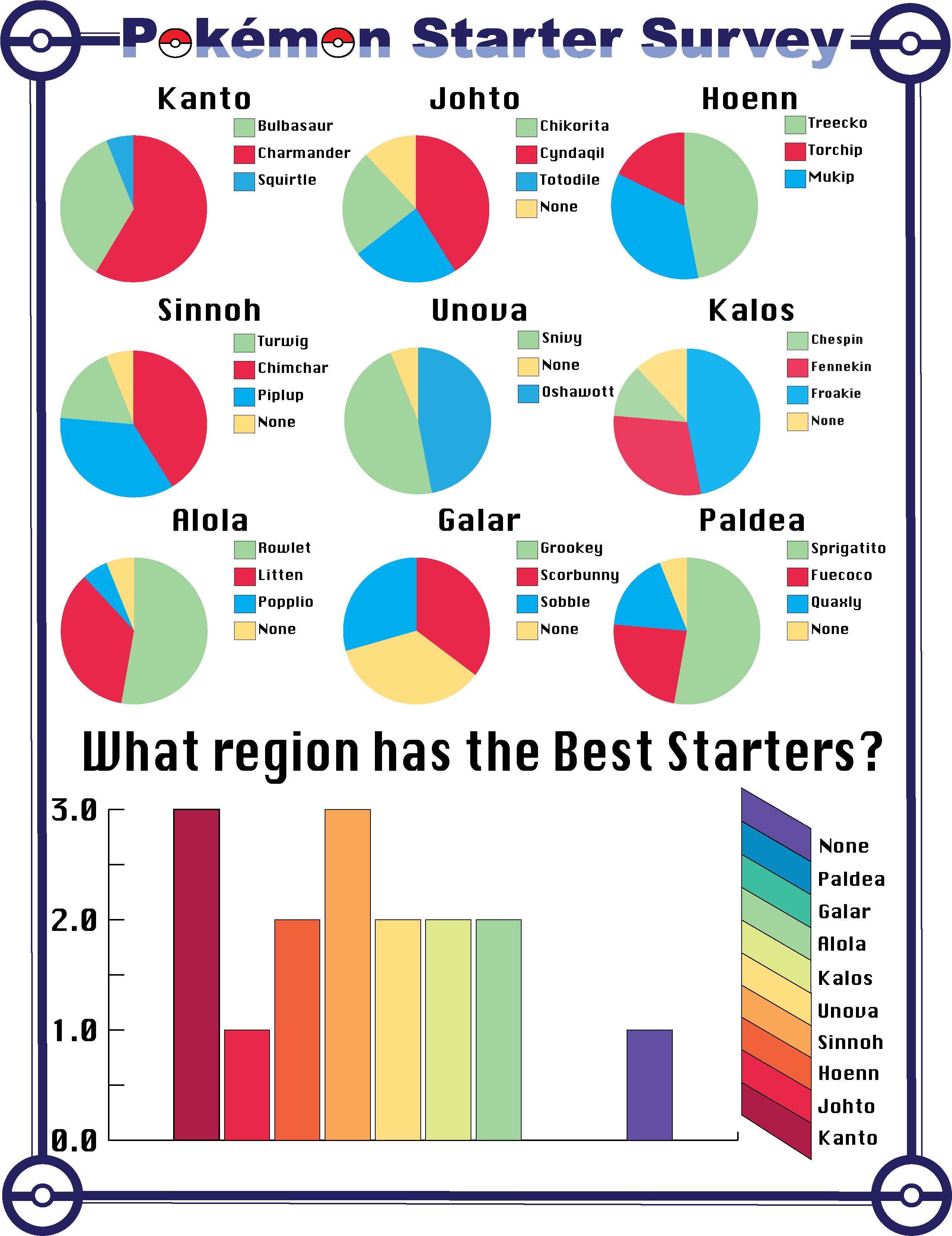
This project began with a simple question: what are the favorite starter Pokémon among Hunter College students? I have been a Pokémon fan all my life, and one of the most personal aspects of this franchise is choosing your starter companion at the beginning of the games. Favorites often change from person to person, which is why I made the survey questions as simple as possible. On release order, I asked the favorite starter Pokémon for each region, and also if the respondent had played the game where those starters appeared. I did not include the results of the later questions because they were irrelevant to what the survey wanted to portray, but curiously, more than half the respondents had played the games. I posted the survey on the Hunter College Discord server and the server for the anime/manga appreciation club. The hardest part of the project was formatting everything to visually represent the data. I originally planned to do bar charts for each region’s results, but pie charts looked prettier next to one another. The colors also represent the typing of the starters: fire types are red, grass are green, and water are blue. Overall, it was a fun project, though I spent a lot of time figuring out how to adjust the pie chart colors. The bar chart for the overall favorite trio was chosen because it’s easier on the eyes than a pie chart with many options. I wanted the charts to be easy to read with a nice color palette, and I am proud of the results.
Back to Home